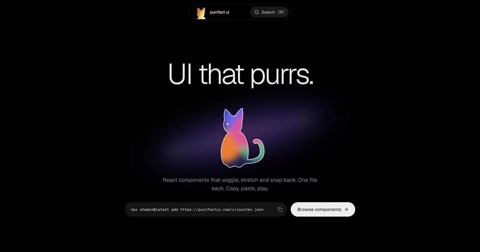

purrfect ui
UI that purrs.
Animated React components with sound. Install with the shadcn CLI or copy the source.

purrfect ui is a shadcn registry built with Next.js, Tailwind CSS and TypeScript. Every component is animated with Motion, plays a synthesized sound cue, honors prefers-reduced-motion and installs straight into your codebase. You own the code: no package to depend on, restyle anything. The components are extracted from my own projects (Poinu, Mapinly, Bountydesk, portfolio).
Quick start
Install any component with the shadcn CLI:
npx shadcn@latest add https://purrfectui.com/r/<component>.json
For example:
npx shadcn@latest add https://purrfectui.com/r/button.json
Browse every component with a live preview (installable ones also show their source and props) at purrfectui.com/components.
MCP (Claude Code, Cursor, Codex)
Not tested end to end yet; tracked in #1.
In your project, add this to components.json:
{
  "registries": {
    "@purrfectui": "https://purrfectui.com/r/{name}.json"
  }
}
Then:
npx shadcn@latest mcp init --client claude
# or: --client cursor | vscode
Ask: add @purrfectui/button
Not add button on its own. That looks in the default shadcn registry.
Running locally
git clone https://github.com/Vaibhav91one/purrfect-ui.git
cd purrfect-ui
pnpm install
pnpm dev          # http://localhost:3000
pnpm registry:build   # after changing a component or registry.json
pnpm build
How it's built
Layout
app/the platform: the home page and the/componentsgallery (a component opens in a dialog,?c=<slug>)registry/<slug>/one folder per installable component:<slug>.tsx(the installable file) anddemo.tsxlib/components-data.tsthe gallery list (name, category, description); a component counts as installable once it is inregistry.jsonlib/component-docs.tsusage snippet, props and behaviours shown in the dialogregistry.jsonlists every installable item;pnpm registry:buildwritespublic/r/*.json(also runs beforepnpm build)
Next 16: read node_modules/next/dist/docs/ before relying on older Next APIs (see AGENTS.md).
Sound
Every interaction has a cue, synthesized live by Cuelume (no audio files). components/providers/sound-provider.tsx owns it: on by default, the saved choice lives in localStorage (sound), and the first pointerdown/keydown unlocks audio (browsers block it before a gesture). lib/sound.ts is the only file that imports Cuelume.
Two ways to add a sound:
- Attribute, for a plain click:
data-cuelume-tap | toggle | open | close | navigate | select | typeon the element.bind()(called by the provider) listens once for the whole page. - From code, for outcomes:
const { play } = useSound(); play("success", { emphasis: "subtle" }).
Where sound is wired today:
| Where | Cue |
|---|---|
| Notch open / close / menu rows / search | open, close, navigate |
| Notch theme and sound toggles | toggle, tap |
| Hero "Browse components" link | navigate (data-cuelume-navigate) |
| Copy buttons (the whole hero install pill, path view, component sheet) | success, subtle, only after the copy worked |
Pick the cue by the job (copy = success subtle, route change = navigate, switch = toggle). Cat sounds (purr, meow, steps) are parked in lib/cat-sounds.ts, not wired in.
Toasts
Copying shows a toast. The host is one shared sonner <Toaster /> in components/ui/sonner.tsx, mounted in app/layout.tsx; call toast.success(...) etc. from sonner for anything new.
"In the wild" clips
A component that came from a real site can show a short clip of it running there: the hero, a scroll to the component, a camera push-in, one interaction, then back to the hero so the loop has no seam. It plays on card hover and in the dialog's "In the wild" tab. Add an entry (target is a CSS selector on the live page) to scripts/capture/clips.mjs, then run pnpm capture <slug> (or all, --base http://localhost:3000 for a local copy of the site). The capture renders frame by frame in virtual time, so it is a true 60fps (960x600) however slow the machine is; it needs Chrome and system ffmpeg. The files land in public/previews/ and the slug is listed in lib/clips.json; without a clip nothing extra shows.
Quality gate for a component
Every component has to pass the same gate before it goes in registry.json. The rules come from CLAUDE.md and the animate, review-animations, apple-design and break-ui skills.
pnpm check <slug>            # static rules + eslint + tsc; exit 1 on any FAIL (pnpm check all, --fast skips eslint/tsc)
pnpm check --rules           # every rule and why it exists
pnpm check:selftest          # proves each rule fires on bad code
pnpm check <slug> --install  # scaffolds a throwaway Next app, shadcn-adds the component from :3120/r, tsc + next build
A deliberate exception is a comment on the same or previous line: check-ignore: <rule-id> <reason>. A WARN needs a one-line reason in the PR; a FAIL blocks.
Port checklist, in order:
- Copy the component into
registry/<slug>/<slug>.tsx, strip site-only imports so it is one self-contained file (onlyreact, declareddependencies,@/lib/utils). - Wire it:
registry.json(withdependencies),item()inlib/components-data.ts,DOCSinlib/component-docs.ts(endbehaviorswith the Reduced-motion line),DEMOSincomponents/gallery/demos/demos.tsx. pnpm check <slug>has no FAIL.- Worst-case states: add
registry/<slug>/worst-case.tsx(long and unbreakable labels, 0/1/1000 items, missing optional props, RTL, non-Latin text, huge numbers), list it inapp/dev/fixtures.ts, open/dev?c=<slug>(dev only; width and RTL toggles) and fix what breaks (/break-ui). - Browser pass at 1470 and 390 wide, dark and light, 200% zoom: no overflow, visible focus ring, keyboard path (Tab, Enter/Space, Esc, arrows), reduced motion is gentler not zero, no stuck hover on touch, clean console, no layout shift.
- Skill reviews:
/review-animationsthen/animatefor its fixes;/apple-designfor anything gesture or spring (interruptible, velocity handoff, press feedback on pointer-down, rubber-banding). pnpm check <slug> --installpasses.- Optional clip (
scripts/capture/clips.mjs,pnpm capture <slug>). The same recorded clip (public/previews/<slug>.mp4, 60fps) is what gets posted.
Contributing
Issues and pull requests are welcome. See CONTRIBUTING.md for how to add a component and the quality gate it has to pass.
License
MIT. Use, modify and ship the components in anything you build, personal or commercial.
Built by Vaibhav · @VrsatileVaibhav · GitHub