Lyra UI: UI, made light 🪶 ✨




Tested on every modern engine — see Browser & Node support for what CI actually proves for each:


Free, independent web components for accessible forms, dashboards, charts, and AI chat/agent interfaces. Built with Lit; works with Lit, React, Vue, Angular, Svelte, and plain JavaScript.
Browse the live docs site → — every component with a live example, source code, and API reference.
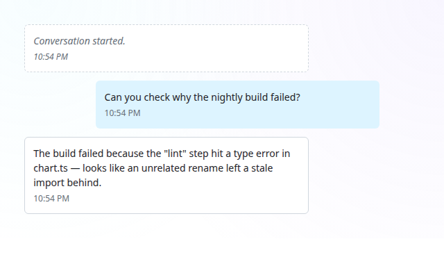
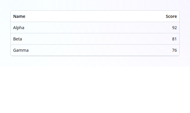
A few of 311 custom elements — browse them all live →
Table of Contents
- Quick Start
- Highlights
- Upgrading
- Principles & Guidelines
- Components
- Theming, internationalization & RTL
- Framework integration
- SSR & Declarative Shadow DOM
- Browser & Node support
- Built with
- Documentation
- Codex and Claude Code plugin
- Status
- License
Lyra UI is a free, independent alternative to Shoelace and Web Awesome. It is an MIT-licensed, framework-agnostic web-component library built with Lit, for use with Lit, React, Vue, Angular, Svelte, and plain JavaScript. It covers production interfaces: accessible form controls, navigation, overlays, dashboards, data visualization, file workflows, and a complete conversation and agent UI toolkit for chat products. It runs on native custom elements, has no runtime dependency on Shoelace or Web Awesome, and ships with its own design tokens, localization runtime, RTL support, reduced-motion behavior, and form-associated controls.
Lyra also makes migration practical. Selected components expose a documented Web Awesome-compatible
surface under the lr- prefix, so many wa-* integrations can move through a mechanical tag-name
and import change, with intentional differences documented per component. Shoelace users get a
clear sl-* → lr-* component map and migration notes; Lyra is an independent implementation,
not a fork, rebrand, official product, or affiliated project. No Web Awesome Pro source code was
available to or used by the maintainers.
| Package | Description | Version | Size |
|---|---|---|---|
packages/lyra-ui |
Free, independent web components for Lit, React, Vue, Angular, Svelte, and plain JavaScript. |  |
|
packages/lyra-flags |
Optional waving flag SVGs for <lr-flag>, kept out of lyra-ui's install by default. |
 |
n/a — SVG assets, not a JS bundle |
packages/lyra-docs |
Experimental DOCX editor companion with a bundled, lazy document engine; document viewers stay in lyra-ui. |
 |
See the package README |
packages/lyra-gen |
Generated views, interactive answers and host-owned dashboard persistence under an explicit compatibility profile. |  |
See the measurement guide |
packages/lyra-map |
Optional modular renderer and shared module worker for <lr-map>. |
 |
See the package README |
packages/lyra-3d |
Optional WebGL engines (three.js) for opted-in 3D views, loaded on demand; not yet released. |  |
See the package README |
packages/lyra-ide |
Editor data (Custom Elements Manifest, JetBrains web-types, VS Code HTML/CSS custom data), versioned with lyra-ui. |
 |
n/a — JSON data |
packages/lyra-translations |
The 70 built-in locale catalogs, versioned with lyra-ui. |
 |
n/a — opt-in locale modules |
See each package's own README for full install/usage details. For generated interfaces, start with the Lyra Gen quickstart, chat integration, or saved-dashboard host example.
Quick Start
Use with AI coding agents
Run npx lyra-ui init-agents in your project (add --agent <name> if not auto-detected, --json for machine-readable
output) to install the bundled lyra-ui and compose-lyra-interfaces skills for Claude Code, Codex, OpenCode, Cursor,
Gemini CLI, GitHub Copilot, Amp and Windsurf; re-running is safe. Options and the marketplace route:
package README and Codex and Claude Code plugin.
Manual setup
npm install @aceshooting/lyra-ui
import '@aceshooting/lyra-ui/components/lr-combobox.js';
import '@aceshooting/lyra-ui/components/lr-option.js';
<lr-combobox label="Fruit" clearable>
  <lr-option value="a">Apple</lr-option>
  <lr-option value="b">Banana</lr-option>
</lr-combobox>
Per-component optional peers and the tree-shakeable import patterns:
packages/lyra-ui/README.md#install.
For new apps, start from the Lyra signature starter;
for arbitrary server/CMS markup, use the guarded
autoloader.
🔗 Open in StackBlitz — try it in-browser, no local install.
For local development of this monorepo:
pnpm install
pnpm build        # builds every package
pnpm test         # tests every package
pnpm lint         # contract-policy, source checks, TypeScript, and type-surface tests
pnpm docs         # Storybook docs site demoing every component
pnpm run migrate-wa --help  # print migration tool usage
pnpm run test:migrate-wa     # run migration fixture/tests
Contributors and AI coding agents working on this repo: see AGENTS.md.
Highlights
- Six composable looks (Lyra, shadcn, Material, data, terminal, high contrast) with independent solid/glass surfaces, density, mode and accent, plus a documentation theme builder for validated presets.
- Conversation UI: progressive Markdown, code headers with copy controls, scrollable GFM tables, task lists and expandable tool-call blocks.
- Navigation and overlays: context menus, menubars, navigation menus, toggles, app-rail and multi-split, with opt-in browser top-layer popups.
- Localization: 70 optional translation catalogs plus built-in English.
The feature guide has APIs and examples; the roadmap
records shipped releases and open work, including native document editing.
Upgrading across a major? The upgrade table lists what
breaks in each major since v22, with the matching lyra-ui-migrate profile; full history is in the
package changelog and archive.
Principles & Guidelines
| Principle | Description |
|---|---|
| 🆓 Free & Open Source | MIT-licensed and free — nothing hidden inside |
| Framework Agnostic | Works with Lit, React, Vue, Angular, Svelte, and plain JavaScript — no framework wrappers required |
| 🪶 Lightweight & Tree-Shakeable | Stable per-component entry points; optional peer integrations remain optional |
| ⚡ Performance-First | Native custom elements with no virtual DOM or framework wrappers |
| 🤖 AI & Agentic-AI Ready | Machine-readable docs and manifests AI agents use correctly |
| 🧩 Consistent Architecture | One shared base — learn one component, know them all |
| 🎨 Design Tokens Only | Every value is a --lr-* token — restyle from one place |
| 🌍 i18n & RTL by Default | Every string translatable, every layout mirrors RTL |
| ♿ Accessibility First | Correct ARIA in shadow DOM, automated a11y checks |
| 📐 Responsive by Allocation | Adapts to its container, not just the viewport |
| 🎬 Motion-Aware | Themeable timing, honors prefers-reduced-motion |
| 🔗 Synchronized Public API | Docs, tests, and manifest always match the code |
| 🔒 Responsible Disclosure | Private reporting, 90-day coordinated disclosure |
Components
311 custom elements across eleven component families. Every tag has a live, interactive example on the
docs site; for the full per-tag reference (Web Awesome
mirror, props, events, slots, parts) see
packages/lyra-ui/README.md#components.
Use the stable tag alias @aceshooting/lyra-ui/components/lr-<name>.js to register one element;
the alias stays valid if the component's internal family changes. Import
@aceshooting/lyra-ui/components/<family> to register a whole family at once.
| Family | Highlights |
|---|---|
forms |
button, input, textarea, select, combobox, date picker, phone/token input, color and swatch pickers, emoji picker, locale/currency pickers, code editor, checkbox/radio/switch/slider, toggle and toggle group, time range, rubric form |
layout |
page, tabs, menu, menubar, navigation menu, command palette, breadcrumb, details, card, widget, split, stepper, carousel, scroller, app rail, dock panel, dashboard grid, drilldown panel, filter bar, segmented, virtual list, responsive panel |
overlays |
dialog, drawer, overlay, context menu, toast, callout, badge, chip, kbd, rating, progress, spinner, skeleton, empty |
data |
table, data grid, tree, timeline, calendar, gauge, heatmap, sparkline, word cloud, stat, pagination, query builder, flow canvas and nodes, sequence strip, file tree, env list, context meter |
charts |
Chart.js-backed lr-chart (optional peer) |
conversation |
chat message, composer and viewport, structured message parts, prompt input and queue, streaming text, markdown, code block, model select, realtime session, selection toolbar, branch picker, checkpoint, message actions and feedback, push-to-talk, audio visualizer, thread list |
agent-tools |
agent run and trace, thinking panel, subagent panel, MCP app, prompt studio, schema viewer, tool call chip, tool approval dialog and approval queue, task list, terminal, span waterfall, stack trace, test results, activity feed, context inspector, artifact panel, commit card, eval dataset/run/result, evaluation dashboard, policy summary |
retrieval |
retrieval search and results, retrieval comparison, grounded RAG answer, claim evidence, grounding summary, RAG evaluation dashboard, citation badge, chunk inspector, knowledge base and admin, ingestion queue, knowledge-graph explorer, graph, mind map, embedding explorer, entity card/chip/dossier, provenance panel, memory panel, neighbor list, path strip |
viewers |
document, PDF, DOCX, PPTX, spreadsheet, CSV, notebook, ebook, email, calendar, contact, archive, XML, SVG, HTML, GeoJSON and 3D model viewers, document compare and preview, dataset viewer, highlight layer, page rail |
media |
video and video playlist, image viewer and comparer, lightbox, sandboxed zoomable frame, pan/zoom, AV player, playback, animated image, avatar and avatar group, file icon, file input, attachment chip, map, QR code, flag |
utility |
icon, format, copy and export buttons, diff view, JSON viewer, divider, live region, mention popover, tour, poll status, known date, resize/intersection/mutation observers |
Theming, internationalization & RTL
All 311 tags share three guarantees, not opt-in per component: theming through --lr-* design tokens (declared once per document and
re-derived at theme scopes; a light/dark base in theme.css, optional looks, and an independent style API for look, surface, density, mode and accent;
styling guide),
internationalization through one runtime (registerLyraLocale/setLyraLocale or a per-instance .strings
override, no rebuild), and RTL with zero opt-in (dir="rtl" anywhere up the tree mirrors layout and keyboard
navigation; lang never changes direction). Usage details:
packages/lyra-ui/README.md#theming-internationalization--rtl.
Framework integration (React, Vue, Angular, Svelte)
Lyra ships plain custom elements — no framework-specific wrapper package needed.
// React 19+
import '@aceshooting/lyra-ui/components/lr-combobox.js';
import '@aceshooting/lyra-ui/components/lr-option.js';
import type {} from '@aceshooting/lyra-ui/custom-elements-jsx';

<lr-combobox label="Fruit" clearable>
  <lr-option value="a">Apple</lr-option>
</lr-combobox>
Vue uses @lr-change="onChange", Angular (lr-change)="onChange($event)" plus schemas: [CUSTOM_ELEMENTS_SCHEMA],
and Svelte 5 onlr-change={onChange}.
React/JSX, Vue, and Svelte each have an opt-in, type-only declaration entry (no runtime wrapper, no tag
registration). Property-vs-attribute binding and event-name casing notes:
packages/lyra-ui/README.md#framework-integration-react-vue-angular-svelte.
Complete React 19, Vue, and Svelte Vite applications live in
[`examples/frame