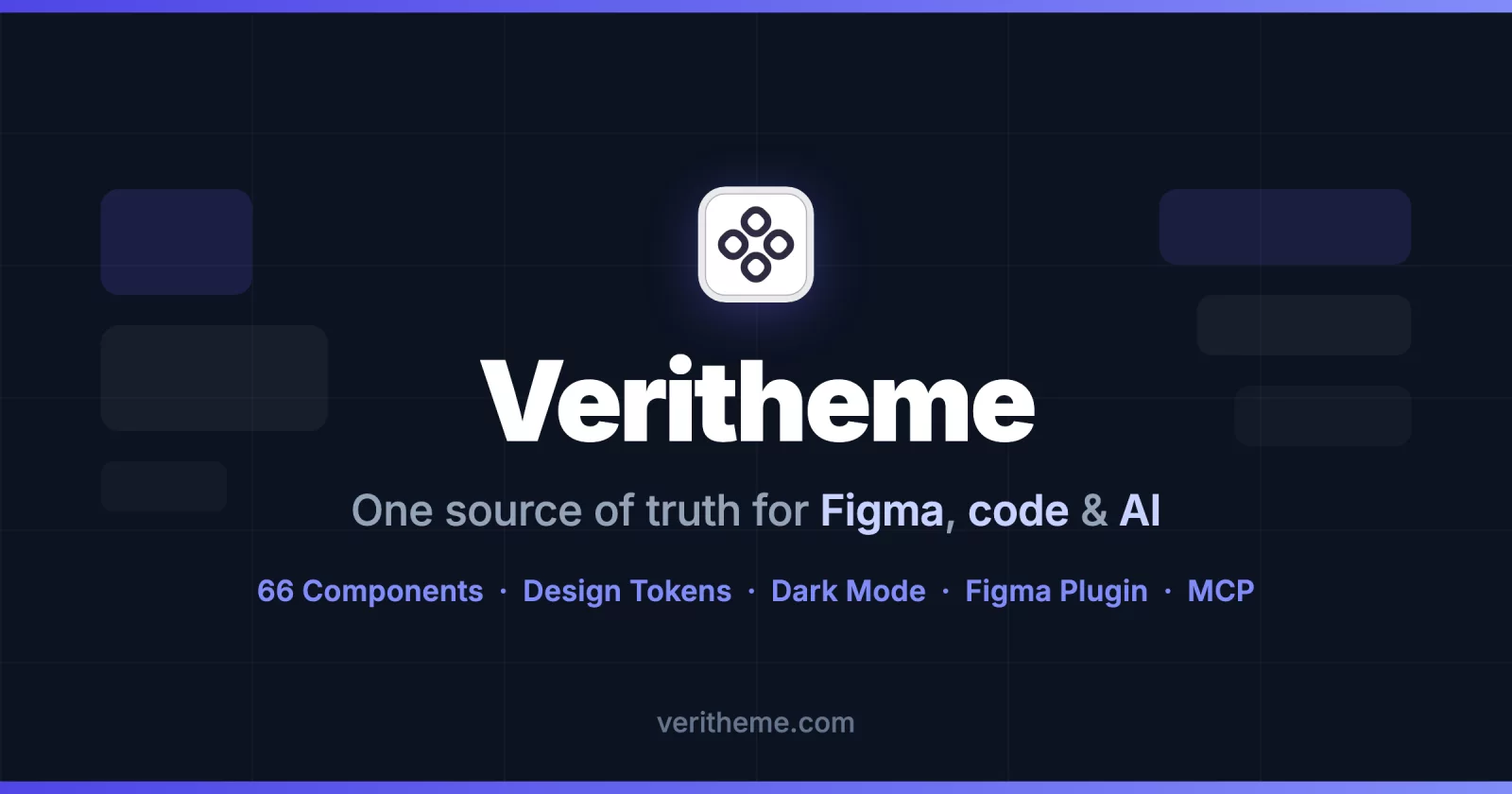
Veritheme
Themeable components and patterns. Pure CSS utility classes, semantic design tokens, dark mode, and a vanilla JS bundle — no framework, no build step required.
veritheme.com · Docs & live demos · Design-system wizard
What is Veritheme?
Veritheme is a framework-agnostic UI component library delivered as plain CSS and vanilla JavaScript. You style your markup with vt- utility classes and drop in data-* attributes for interactive behavior — the JS bundle wires everything up automatically. No React, no Tailwind runtime, no bundler needed.
It's built around a 2-layer design token system (raw palette → semantic tokens) that keeps colors, spacing, typography, and radii consistent across light/dark modes and across three shipped themes. The builder exports CSS and DTCG from the same tokens. Supported variable values can be exchanged with Figma through explicit import/export; manual component structure edits are not automatically transferred.
Install
npm install veritheme
Or use it straight from a CDN with no install at all:
<!-- CSS -->
<link rel="stylesheet" href="https://cdn.jsdelivr.net/npm/veritheme/veritheme.min.css">

<!-- JS (auto-initializes interactive components on DOMContentLoaded) -->
<script src="https://cdn.jsdelivr.net/npm/veritheme/veritheme.min.js"></script>
With a bundler:
import 'veritheme/veritheme.min.css';
import 'veritheme'; // initializes interactive components
What's in this package
| File | Description |
|---|---|
veritheme.min.css / veritheme.css |
All components + vt- utility classes + design tokens (minified / readable) |
veritheme.min.js / veritheme.js |
Vanilla JS for interactive components, zero dependencies |
themes/*.json |
Theme token files — default, editorial, rounded-sans |
theme-manifest.json |
Index of available themes (name, label, font, dark-mode support) |
Package exports: the file names above (veritheme/veritheme.min.css, veritheme/veritheme.js, …), plus the aliases veritheme/css, veritheme/css/unminified, veritheme/js/unminified, veritheme/themes/* and veritheme/theme-manifest. A bare import 'veritheme' resolves to veritheme.min.js.
Usage
Utility classes
Every utility uses the vt- prefix:
<div class="vt-flex vt-items-center vt-gap-4 vt-p-4 vt-rounded-lg vt-bg-surface-subtle">
  <span class="vt-text-foreground-primary vt-text-sm vt-font-medium">Hello</span>
</div>
Dark mode
Add .dark to <html>:
<html class="dark">
Themes
Add data-theme to <html> — choose default, editorial, or rounded-sans:
<html data-theme="editorial">
Interactive components
Markup uses data-* attributes as hooks; the JS bundle initializes them automatically:
<div data-accordion="single">
  <div data-accordion-item>
    <button data-accordion-trigger>Title</button>
    <div data-accordion-content>Content</div>
  </div>
</div>
Themes & the design-system wizard
Three themes ship in the box (each with a light and dark variant):
- Default — Inter, clean and neutral
- Editorial — Source Serif 4, editorial / long-form
- Rounded Sans — Manrope, soft and friendly
Want your own? Build your design system. Get the components. The design-system wizard is a 7-step builder — colour scales → semantic palette → shape → spacing grid → typography → component rebinding → hand-off — where every component restyles live as you go. At the end, download the tokens for the Figma plugin and a system package with source, tokens, library CSS/JS, a working demo and AI instructions.
Figma plugin
Veritheme — Design Tokens & UI Components is a design system generator for Figma. Select the components you need, customize your theme, and generate production-ready design tokens and UI components directly into your file.
What it does:
- Generates Figma Variables — colors, typography, spacing, radius, borders, shadows
- Creates Light and Dark mode collections automatically
- Includes 45 UI components: buttons, form controls, navigation, feedback, and data display
- Lets you customize the theme — brand color, neutrals, typography, and semantic tokens — before generating
- Outputs a structured, token-driven component library ready to use in your designs
Who it's for: Designers and product teams who want a consistent, token-driven foundation without building a design system from scratch.
It reads the DTCG tokens the design-system wizard exports: import them into the plugin and a system built in the browser re-themes your Figma library. The exchange is an explicit import/export of supported variable values in either direction; component structure edited by hand on the canvas stays in Figma and is not transferred to code.
Use with AI agents (MCP)
Veritheme ships an official MCP server, @veritheme/mcp-server — AI assistants (Claude Code, Cursor, any MCP client) can query real components, design tokens, themes, and HTML snippets instead of guessing class names:
# Claude Code
claude mcp add veritheme -- npx -y @veritheme/mcp-server
// any MCP client config
{ "mcpServers": { "veritheme": { "command": "npx", "args": ["-y", "@veritheme/mcp-server"] } } }
Tools: list_components, get_component, get_tokens, get_theme, get_snippet, search, list_patterns, get_pattern, get_starter, get_theme_css, derive_theme, audit_contrast, validate_markup — and get_project_system, which reads the system package (veritheme.system.json + DTCG tokens.json) from the project root so the agent works from your tokens, not the presets.
The site also serves veritheme.com/llms.txt — a compact, LLM-friendly map of the library for web-browsing agents.
The Veritheme ecosystem
| Package / repo | What it is |
|---|---|
veritheme |
This package — the CSS + JS distribution bundle |
@veritheme/mcp-server |
MCP server exposing components/tokens/themes to AI agents |
| Veritheme Figma plugin | Generate design tokens + 45 UI components into Figma |
| veritheme.com | Docs, live demos, and the design-system wizard |
License
MIT © Siarhei Tarasenko